After more than 80 years in business, Frodsham based butchers H. E. Coward decided it was time to create a website to showcase their fabulous produce and services, here I’ll explain how the project developed
About Cowards
A well established and very well known butchers and bakers, Cowards has been trading since 1929. The main shop premises, set in the picturesque Cheshire market town of Frodsham, is where it all began. The bakery part of the business produces the very popular brand of “Sue Coward’s Pies”, famous across the North West of England. In addition to traditional butchers produce and backed pies you will also find a wide selection of fresh seasonal game from the local countryside.
There is a large team of staff on both the butchers and bakery side which is currently headed up by Sue and her husband Rob Coward. Rob has worked at the business since 1961 and Sue began in 1973.
Cowards provide cooked food for catering events around the region and wanted to use the website as a way of promoting this further. Christmas is also a very busy time for Cowards, particularly with their fresh Turkeys. In addition to this they also produce a good range of seasonal party food, all the trimmings for your Christmas dinner, Hot Pots, Mince Pies and much more, all of which you will see featured on the new site.
The Final Design
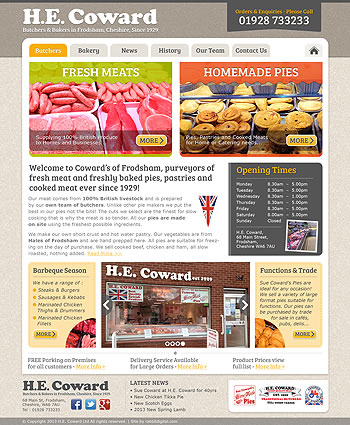
Below you can see the final design, as it was on the day it was published. If you would like to find out more about the project, including the technical side of the site, then keep reading below this screenshot.

The Design Brief
Sales manager Vicki Coward, first got in touch with me back in April 2013. She explained a decision had been made that having spent so many years without a website, now was the time to take the plunge! I had been recommended to her as someone who would do a good job for Cowards and help them create a professional online presence, which is always nice to hear. Don’t just take my word for it, you can read a testimonial from Vicki here.
After a few telephone conversations to discuss the features and general structure of the website Vicki sent the copy for the home page along with the graphics and images to be used. I suggested an alternative way of wording the intro heading which would be beneficial for search but other than this I had everything I needed to get started.
With regard to the colour scheme of the site Vicki mentioned her wish to move away from the bright red and blue that represented the two main sections of the company. Black would replace blue for the butchers department and a darker maroon instead of red for the bakery. She was happy to try an alternative colour way initially, so I settled on an earthy green (hex #BCCE1A) for the butchers and vermilion orange (#E96036) for the bakers dept. You can see the very first draft on the right. Its a boxed layout with a kind of Cotswold stone marble effect background. The accent colour for highlighting the navigation hover effect, text links, H3 titles and buttons is a Golden Yellow (#FBB00A), you could almost say light orange. I sometimes use this really useful HTML colour picker by w3schools.com, its quick, easy to use and outputs web standards hexadecimal colour values to use on your web pages.
The Design Visual
Contrary to current popular responsive web design methods I prefer to design for the desktop first instead of the other way round with most of my projects. As I put so much time and effort into my visuals I am able to show much more of the design of a site in its full view-port. More often than not my clients will be viewing the draft visuals on a desktop screen anyway so it makes more sense for me to do things this way for now. Viewing the visitor traffic stats for many of my other local business clients using Google Analytics I also notice desktop traffic still accounts for a large majority of views.
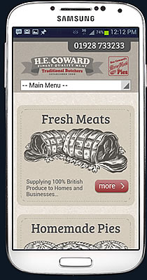
When more local businesses develop websites that give their customers a better online experience using their mobiles then more people will use their mobile devices to search locally. Until then I think the majority will turn to their desktop and laptop computers to checkout the local restaurant, shop or pub. Don’t get me wrong I’m a big believer in responsive websites, I just feel small to medium sized local traders are still playing catchup with the bigger national sites.
Okay, back to Cowards new website. So Vicki has seen the first draft of her new site, she says she likes the overall layout but has a few concerns. I could tell she was being polite so I realised I had to take a different approach especially with the colours. I got on really well with Vicki during the course of the project which was great, it makes discussing design and functionality much easier. She was quite sure now about how she wanted the new site to look. Occasionally I find myself dealing with clients who can’t decide what they want which can really drag out the design process.
Second Design Revision
One of the main issues for the first design draft was the resemblance the uppercase “M” against the Golden Yellow in the buttons had to the supermarket Morrisons logo. I had chosen Bree Serif Regular, available to download for free at Google Fonts, a cursive font style that fitted the scene perfectly. The next area that needed addressing was the colours and the “shop window” style box links for the “Fresh Meats” and “Homemade Pies”, Vicki said really didn’t like these. She preferred a much simpler approach to these panels replacing the images with suitable ink line drawings to represent the different departments. My drawing skills have faded since leaving Art College back in the 80’s so I turned to Google image search for some ideas!
Starting with the header, I replaced the logo I created based on the shop exterior sign-age that was previously fitted and featured in a image I found in search. Using the “ribbon effect” logo artwork that had been supplied I dismantled this, changed the colours and compacted the main elements to make it better fit the space it had to occupy. This provided sufficient space for “Sue Coward’s Home Made Pies” logo and telephone flash on the right. At the bottom of the header sits the main navigation menu for the site in a tabbed, user friendly style.
Into the main content area and as you can see I’ve opted for an open layout instead now which gave me a few extra pixels width on each side to play with. The main box links occupy the top part of the page and feature new line drawings to represent the butchers and bakers departments. I created the stitched line effect in CSS and gave the boxes a subtly transparent background again with CSS using the following declaration “background-color: rgba(193, 180, 160, 0.5);”. For the fonts I avoided using all capitals in the headings, I stuck with Bree Serif Regular and used plain old Verdana for the body text.
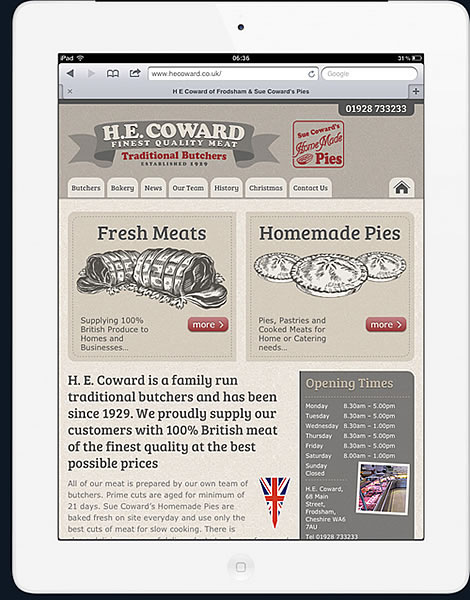
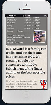
Still in the content area the H1 title, website intro and opening times are next. I carried our some research prior to starting the site into what the most popular search phrases used for Cowards were at the time. This would help determined what elements to use and how prominently they should be placed on the home page. Not surprisingly I suppose but the search phrase “cowards opening times” came out top! I decided these needed to be visible on all devices on the home page and contact us page.
Looking at the iPad view-port on the right you can see I’ve managed to show all the most important information above the fold including the phone number, main product sections and opening times.
At the base of the home page are two boxes, again featuring a “stitched” dashed line effect that will be used to promote latest offers and events. These boxes sit either side of a image slider on desktop and tablet screens and above and below on smaller mobile screens. For the image slider I used one of my favourite WordPress plugins by Josh Leuze that you can download for free here called Meteor Slides, don’t forget to buy him a coffee, or even better a coffee maker!
The footer area simply displays the logo, address and contact details, social media icons, latest news post links and “Assured Food Standards” logo.
Colours
Beginning with the main accent colour we settled for a Firebrick Red (hex #993333) for links, menu button hovers and so on. There isn’t much else to the colour scheme, the idea was to keep it as minimal as possible. I used various tones of greys such as #555555 for the body copy, titles and border lines.
CSS Style
Using media queries such as “@media only screen and (max-width:990px)” I set the main breakpoints at 480px for Samsung Galaxy mobiles, iPhones etc, 685px for small tablets, 767px for iPad and 990px and above for larger screens. I used CSS where I could to achieve the styling and keep the site as lightweight as possible reducing HT requests.
- Key Features and Requirements :
- Responsive Mobile Friendly Design
- @import Google Fonts
- WordPress CMS, easy to use
- User friendly and easy to navigate
- Image Slider
- Latest News Blog
Well I hope you found this interesting and please leave a comment below if you have feedback, would like to ask any questions or just want to say hello!